Background:
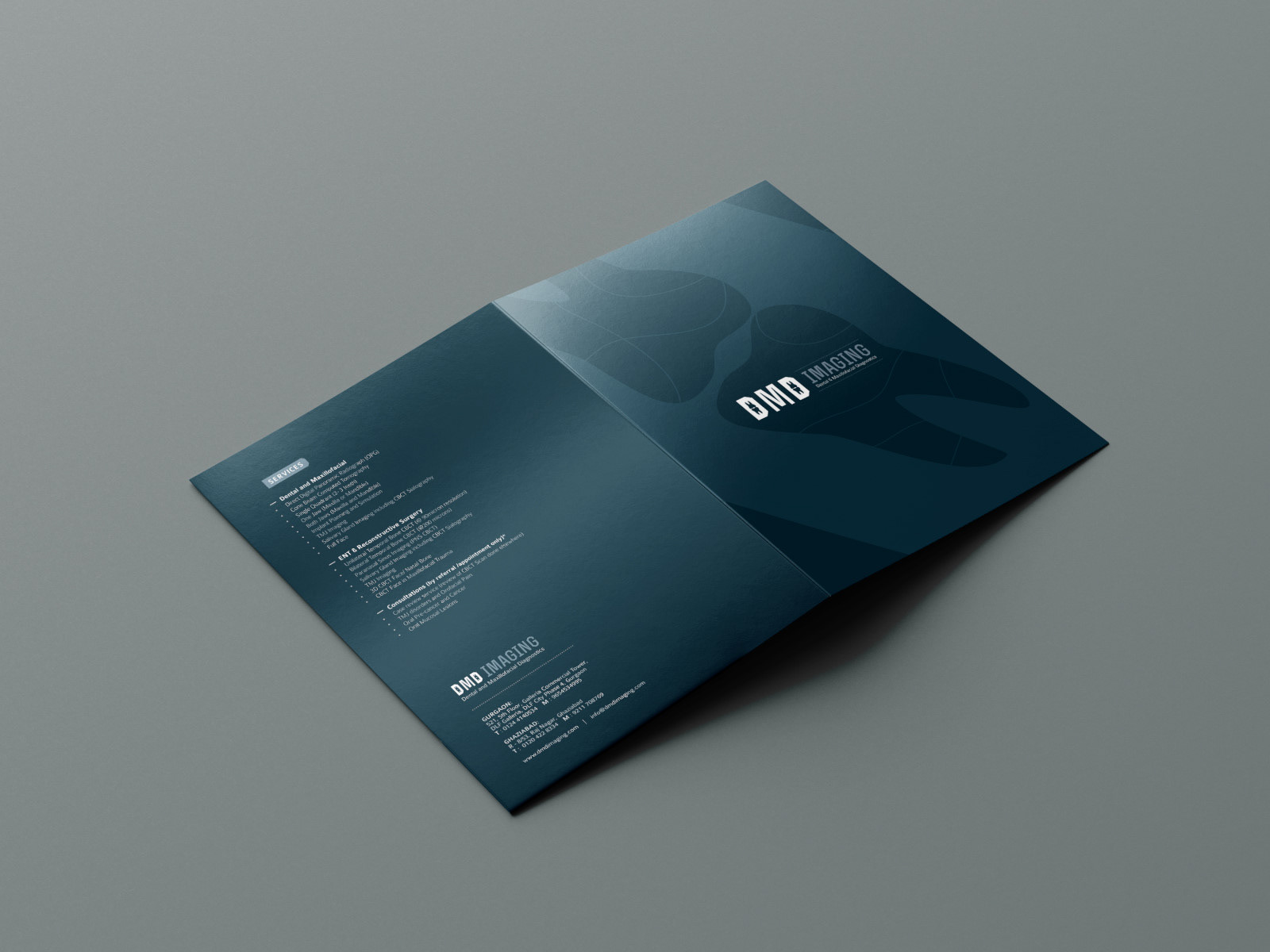
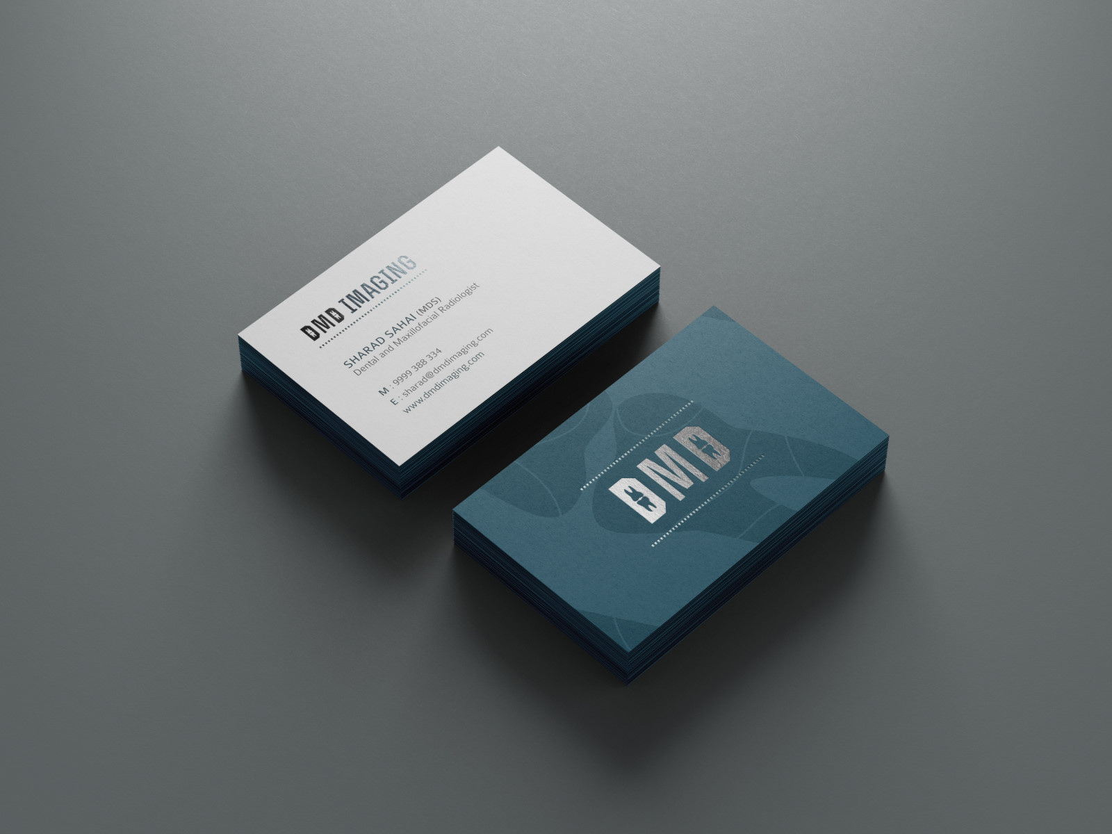
This project entailed creating an identity for a premium dental imaging clinic. The guide was to create an identity as tough as a bone.
Inspiration:
While emulating a bone structure would be generic, our research and approach focussed on creating an appearance which is simple. The element of toughness became our inspiration.
Creation:
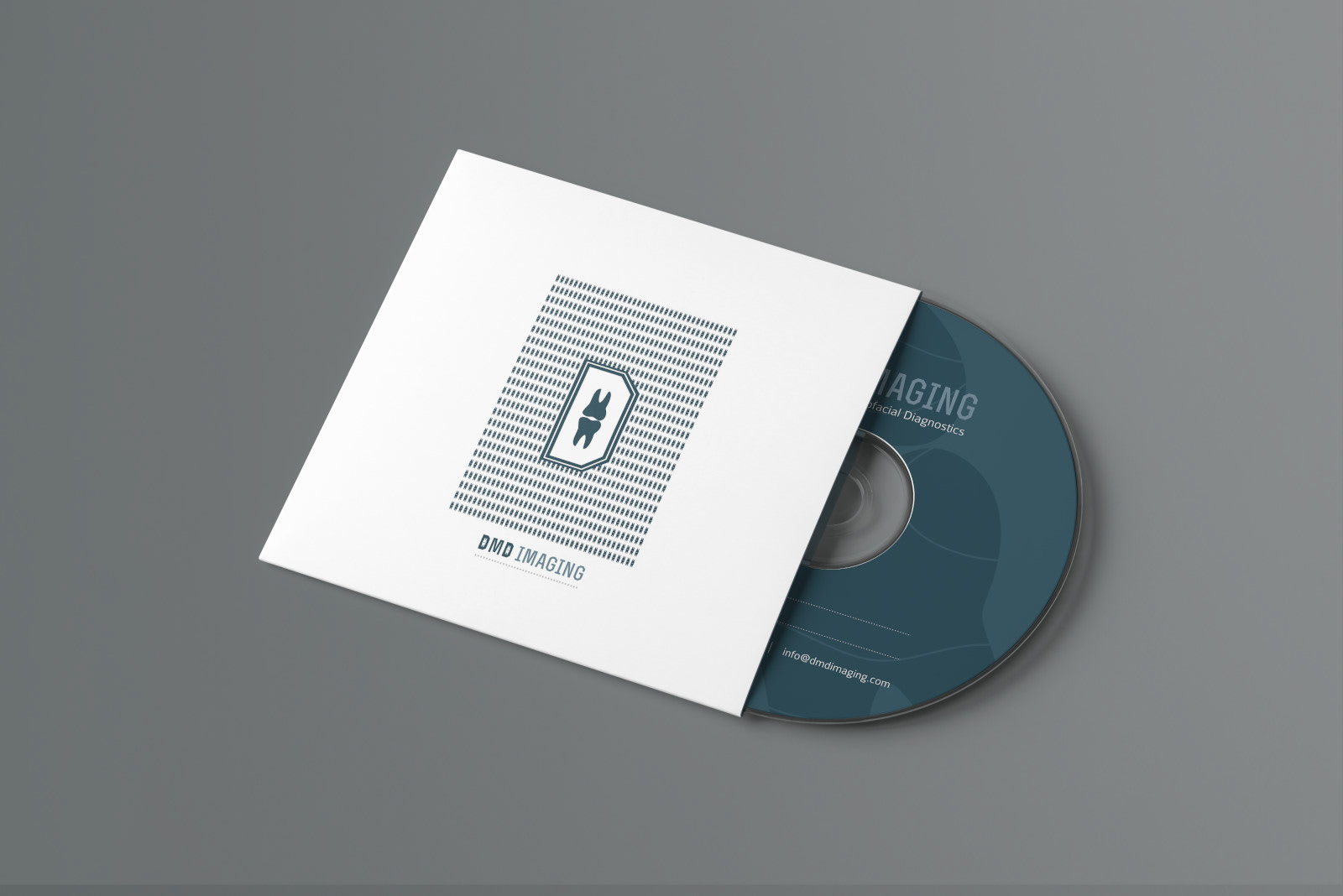
The appearance was designed to maintain a relevance to the business while giving it an edge. The sharp angles in the alphabets have been introduced to reflect the toughness of the letters, accentuated further by use of the molar, the toughest tooth.


